Google's PaperBanana uses five AI agents to auto-generate scientific diagrams
Five AI agents team up to create diagrams for research papers. PaperBanana beats simple image generators but still makes content errors.
Researchers at Peking University and Google Cloud AI Research have built a system that automatically creates scientific illustrations. The PaperBanana framework, based on Google's Nano Banana, uses five specialized AI agents to generate publication-ready diagrams from method descriptions.
Creating illustrations for scientific papers is one of the last manual bottlenecks in day-to-day research, the team notes. AI systems now help with literature research, brainstorming, and running experiments, but visual presentation still takes significant manual effort. Professional illustration tools demand specialized knowledge most researchers don't have.
Previous approaches use code-based methods like TikZ or Python-PPTX. The researchers say these fall short with complex visual elements like specialized icons or custom shapes, now standard in modern AI publications. Pure image generation models look good but rarely meet academic publication standards.
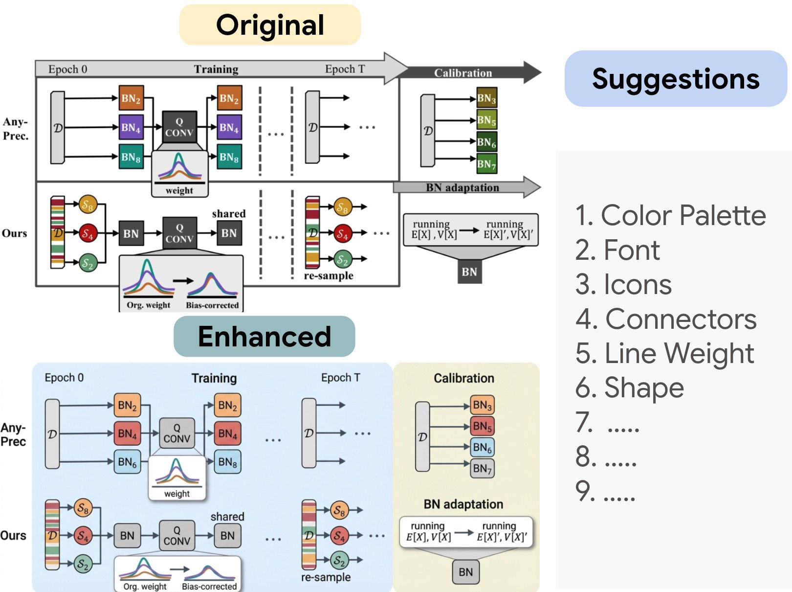
How the five agents split the work
PaperBanana divides tasks among specialized AI agents. The first searches a reference database for similar diagrams to use as templates. The second translates the paper's method description into a detailed image description. The third refines this using aesthetics guidelines the system extracted from NeurIPS publications.
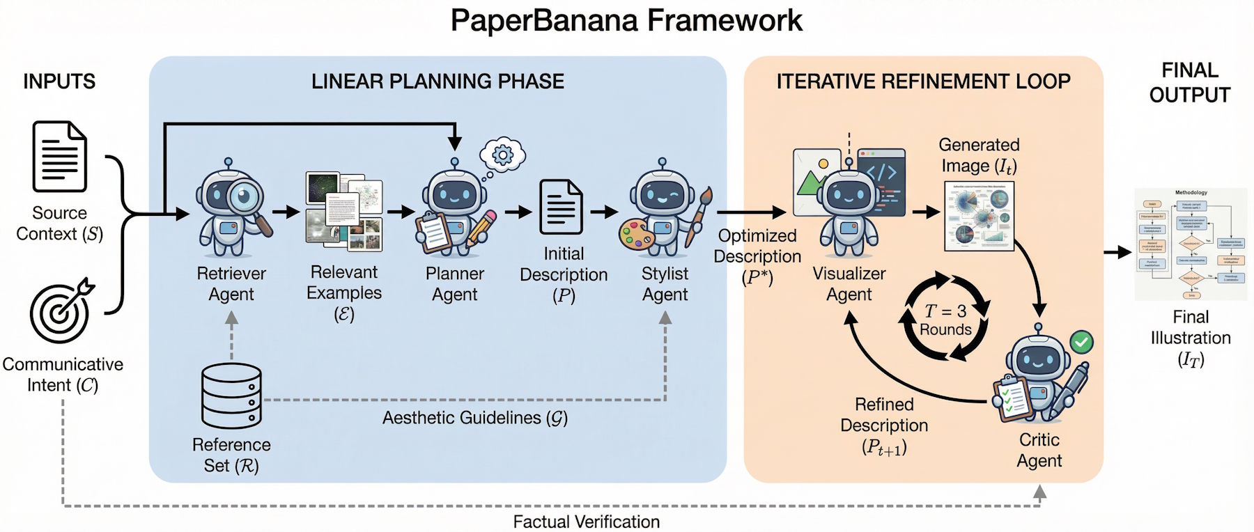
The fourth agent renders the image using an image generation model. The fifth handles quality control: checking results for errors and suggesting fixes. This generation-and-criticism cycle runs three times before outputting the final diagram.
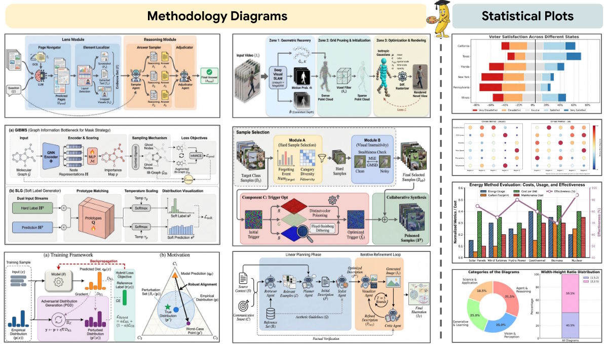
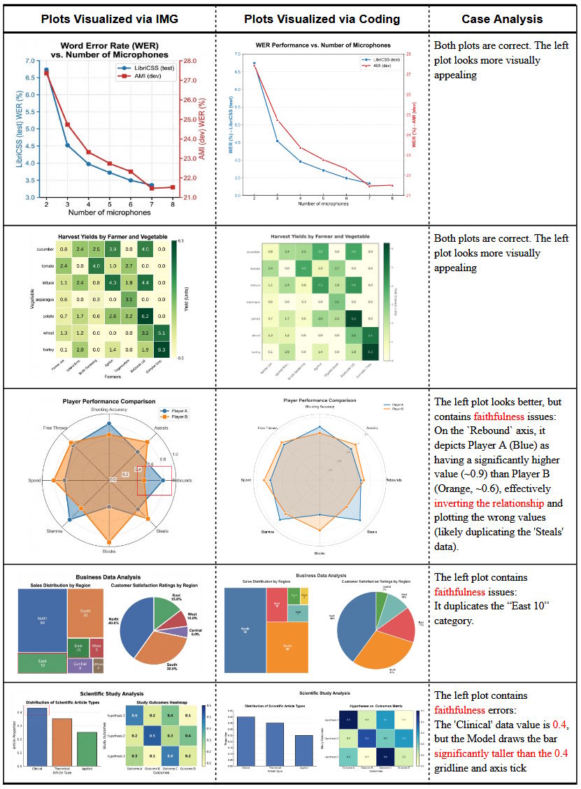
For statistical plots like bar or line charts, the system takes a different route: instead of generating graphics as images, it writes Python code for the Matplotlib library. This keeps numbers accurate, something image generation models often mess up.
Human reviewers pick AI diagrams most of the time
The researchers built their own benchmark with 292 test cases from NeurIPS 2025 publications, scoring diagrams on content fidelity, conciseness, readability, and aesthetics.
PaperBanana beat simple image generation across all categories. Conciseness saw the biggest jump at 37.2 percent. Readability improved 12.9 percent, aesthetics 6.6 percent, and content fidelity 2.8 percent. Human reviewers preferred PaperBanana diagrams nearly 73 percent of the time.
The results also show clear limits. Content fidelity hit only 45.8 percent, below the 50 percent human reference. The most common errors involve details like misaligned connecting lines or arrows pointing the wrong way. Even the critic agent misses these because current language models can't perceive them well enough.
Editing remains a problem
One major limitation: PaperBanana outputs raster images instead of the vector graphics academics prefer. Users can't easily edit the diagrams afterward. The researchers suggest generating 4K images as a workaround for print quality.
Down the road, image processing models could handle minor tweaks. A more complex option would be a reconstruction pipeline using text recognition and image segmentation to extract editable elements. The most ambitious approach: an AI agent that operates vector software like Adobe Illustrator on its own.
Several illustrations in the published paper came from PaperBanana. For practical use, the researchers recommend generating multiple versions and picking the best one manually.
The system can polish human-made diagrams too
The automatically summarized aesthetics guidelines have a bonus use: they can visually upgrade existing human diagrams. In tests, refined versions won 56.2 percent of the time against originals in aesthetics evaluations.
The researchers see a pattern that could apply elsewhere: retrieving reference examples teaches the model what kind of diagram to create, while style summarization teaches what it should look like. Separating content from style this way could work for UI design or technical drawings too.
AI providers keep investing in scientific workflow tools. OpenAI recently launched Prism, a LaTeX editor with GPT 5.2 integration. Meanwhile, experts warn AI could trigger a flood of quickly produced scientific publications.
Using AI image generators for study illustrations isn't new. A few years back, such attempts got called out fast because models failed at visual coherence and readable text. One notorious example was a 2024 journal paper with an obviously botched AI-generated rat diagram that had to be retracted.
PaperBanana isn't publicly available for testing, since the system runs on Google's proprietary Gemini-3-Pro and Nano-Banana-Pro models, which are also closed. More sample images are on the project page.
AI News Without the Hype – Curated by Humans
As a THE DECODER subscriber, you get ad-free reading, our weekly AI newsletter, the exclusive "AI Radar" Frontier Report 6× per year, access to comments, and our complete archive.
Subscribe nowAI news without the hype
Curated by humans.
- Over 20 percent launch discount.
- Read without distractions – no Google ads.
- Access to comments and community discussions.
- Weekly AI newsletter.
- 6 times a year: “AI Radar” – deep dives on key AI topics.
- Up to 25 % off on KI Pro online events.
- Access to our full ten-year archive.
- Get the latest AI news from The Decoder.